Before & After
Some amazing transformations showing before and after photos of the same space. Simply drag the slider across to see what the space looked like before.
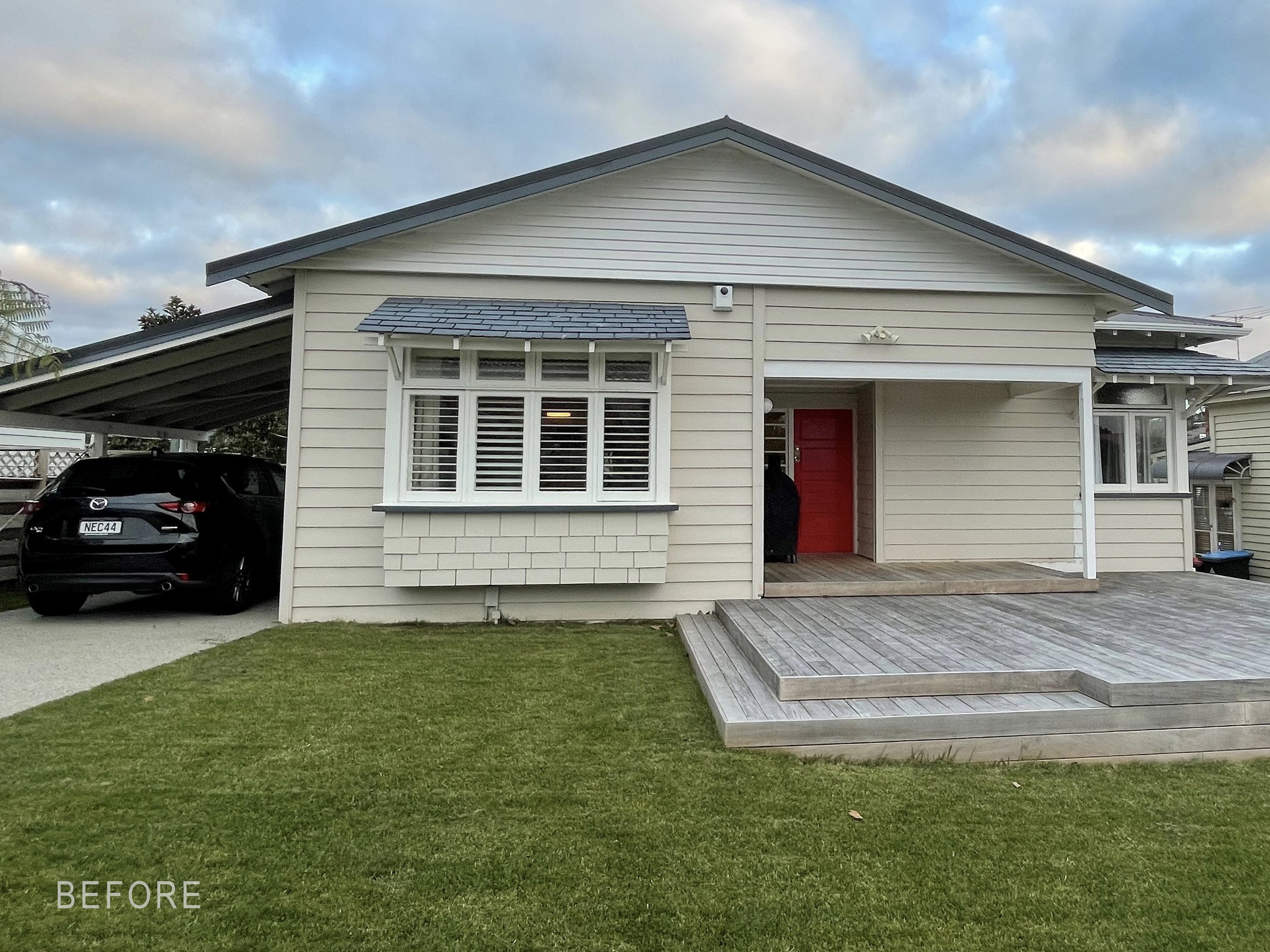
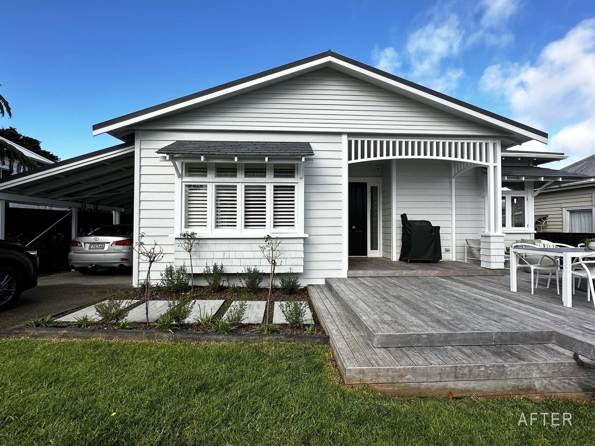
Above: A few small architectural changes and a new paint job make a huge difference to the exterior this 1920s bungalow. Architect: Macfie Architecture
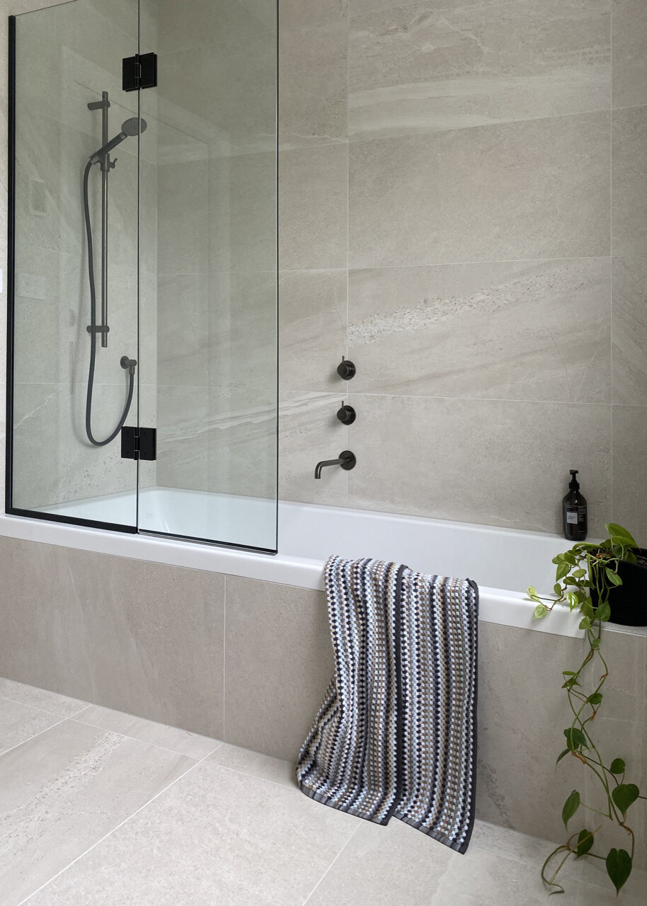
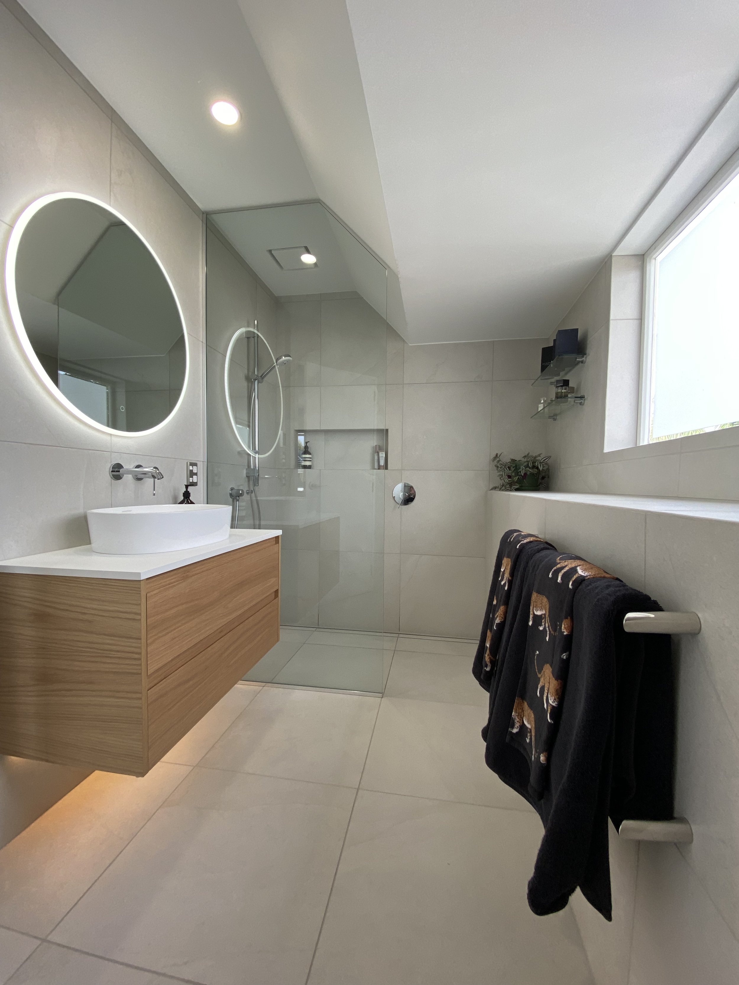
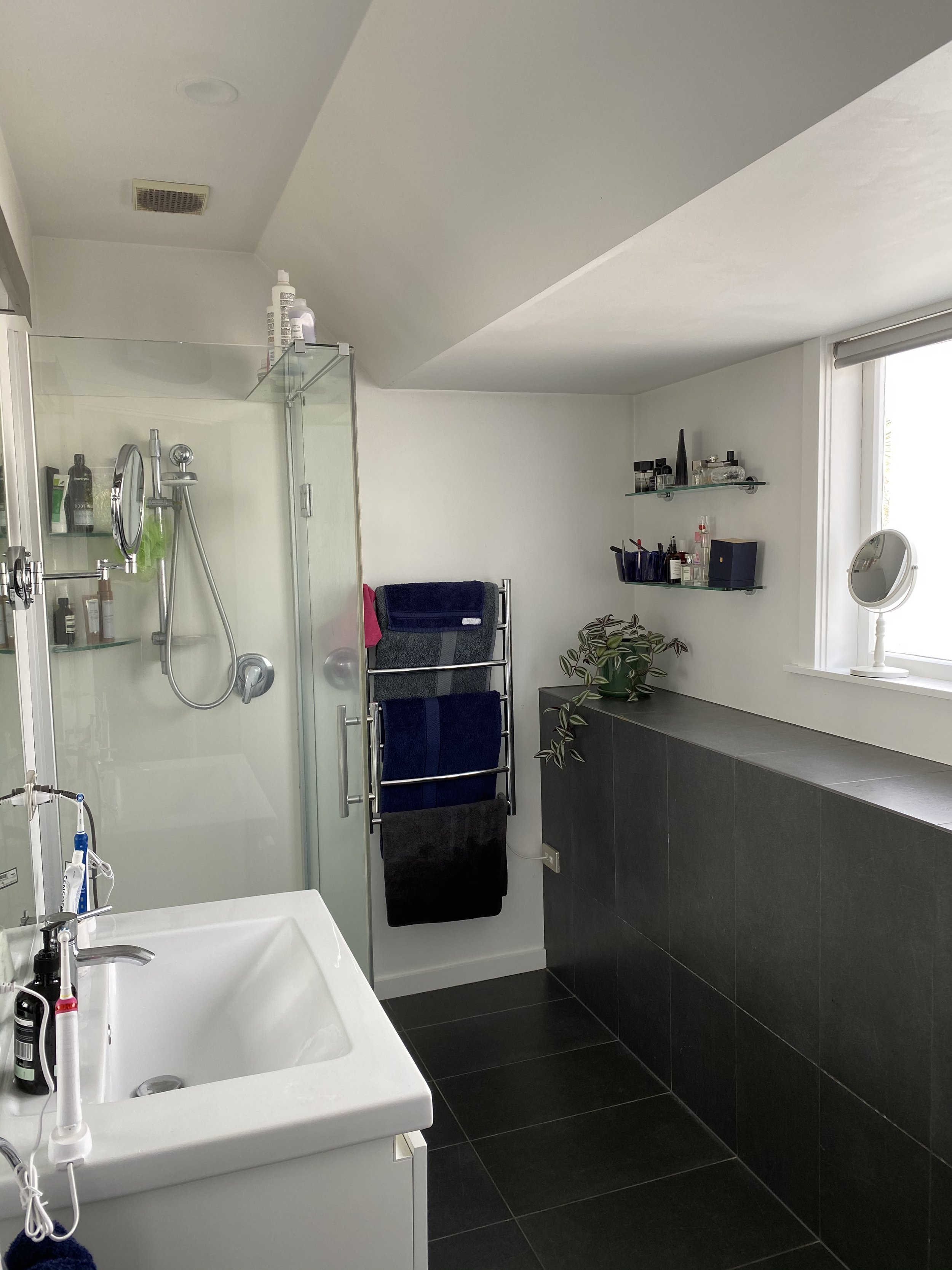
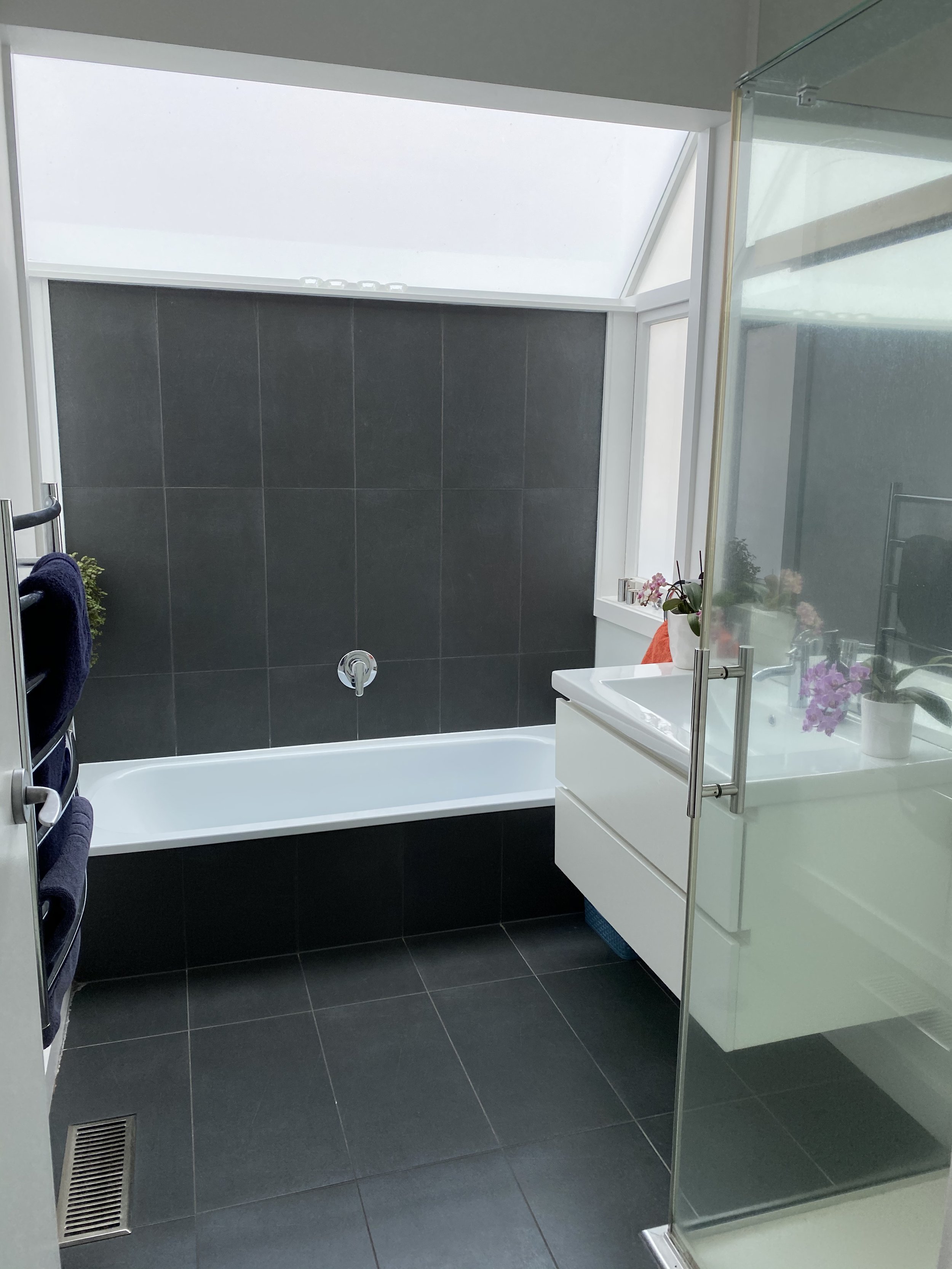
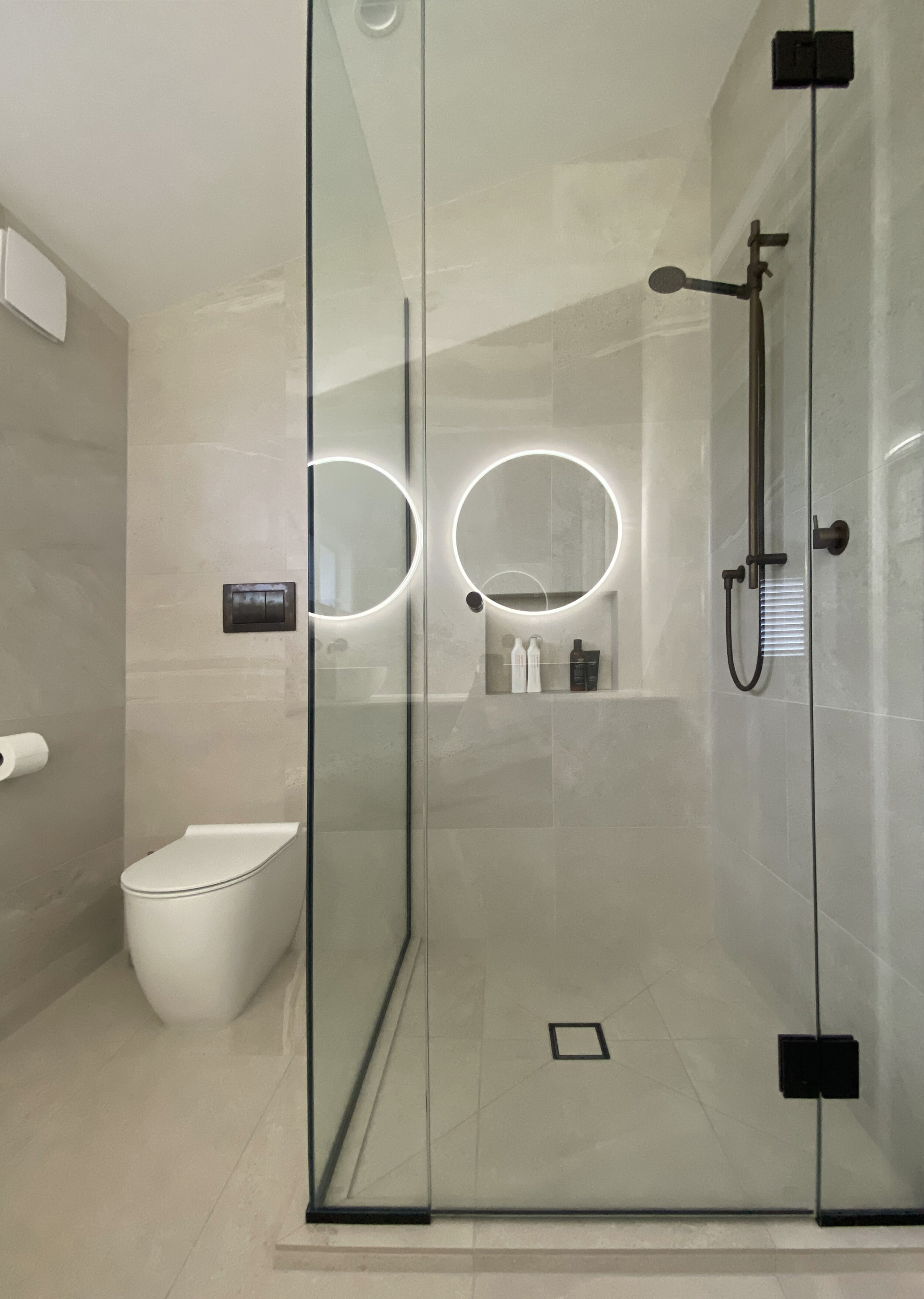
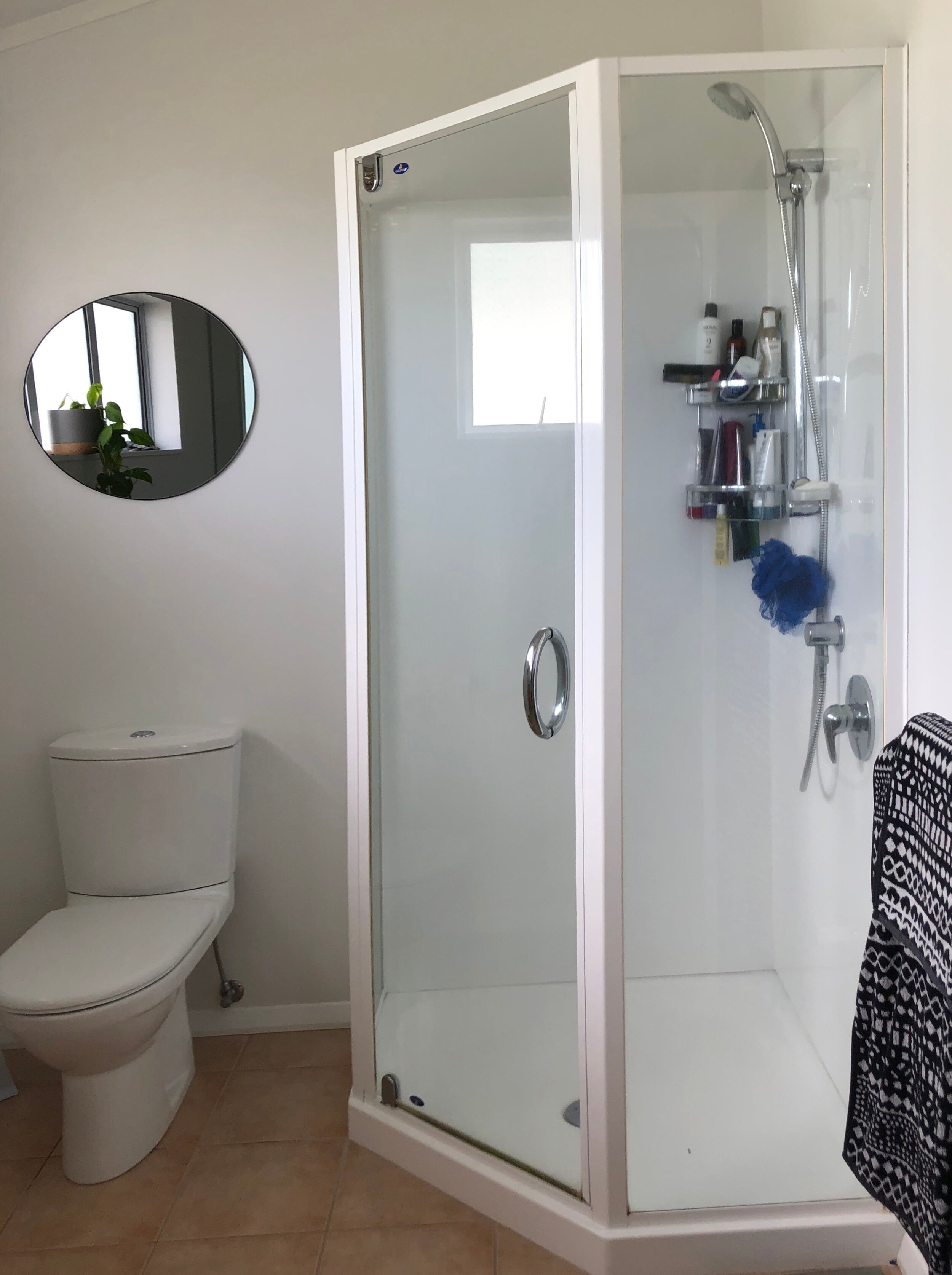
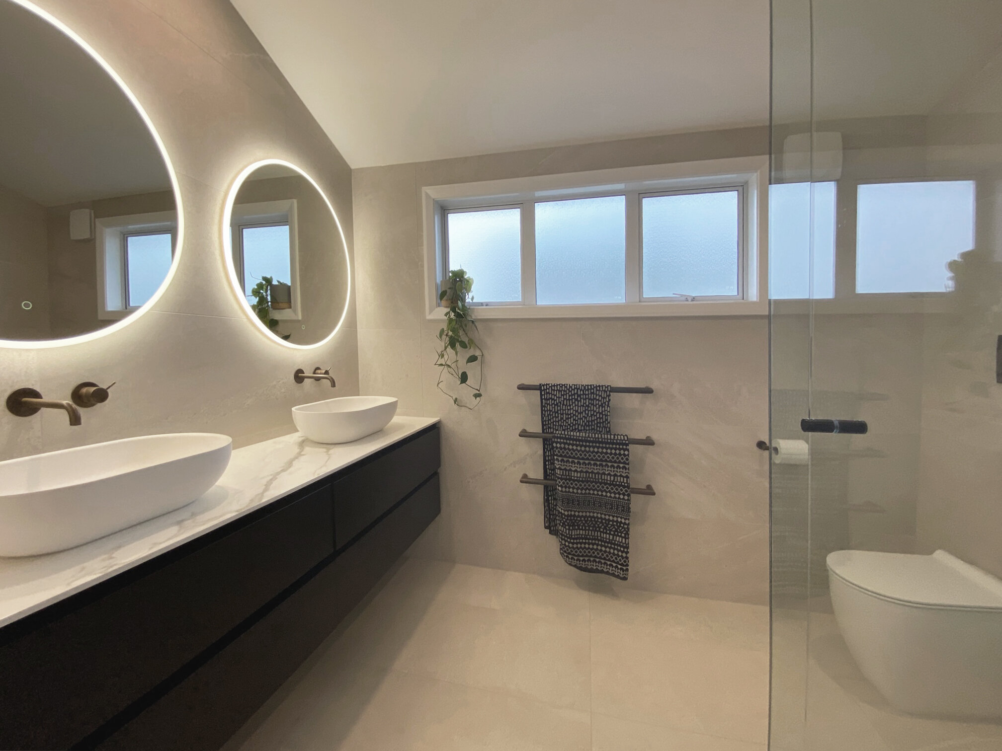
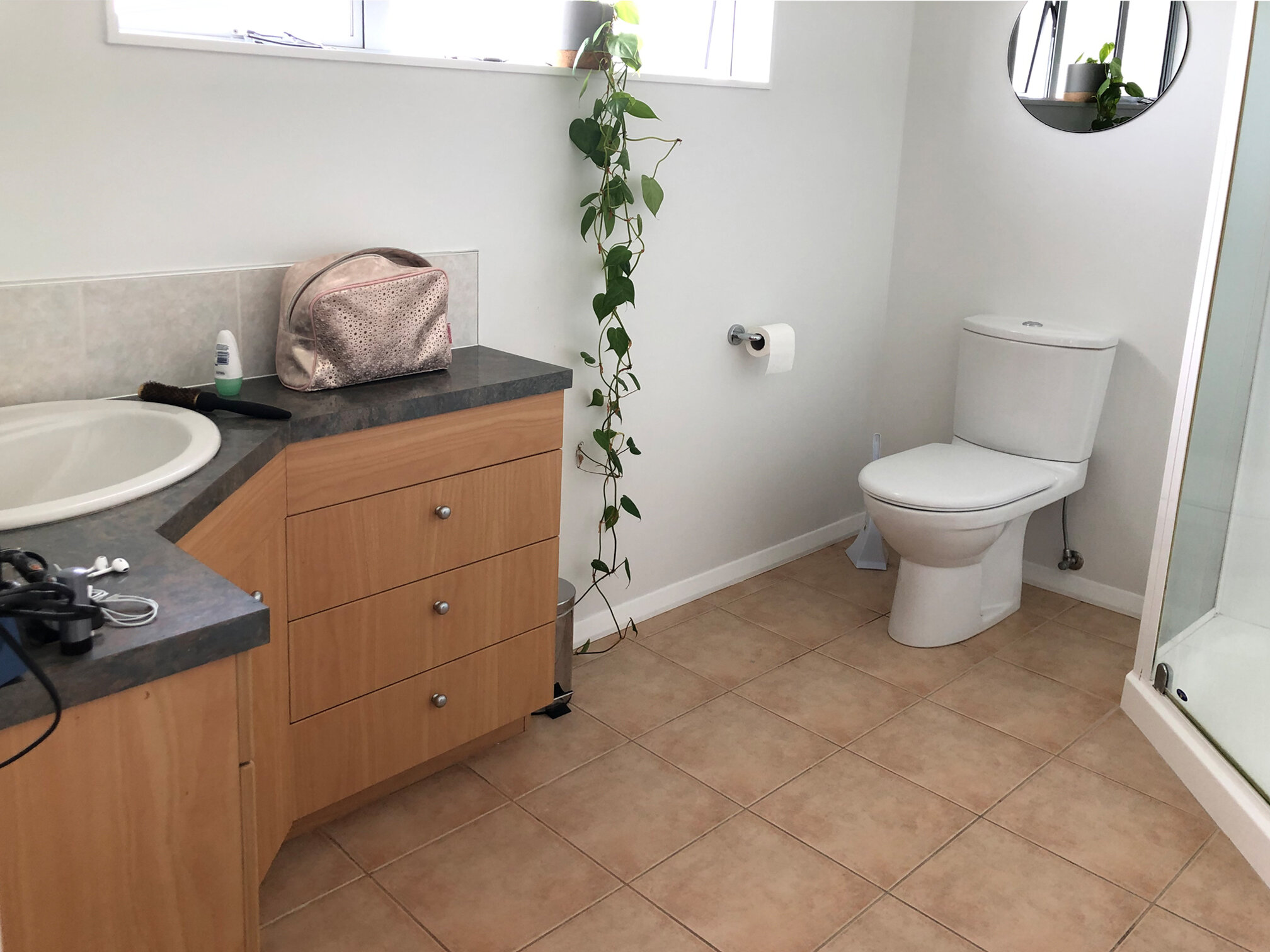
Above: With this small bathroom we kept the existing layout but completely stripped it out and updated it with new fittings and tiles.
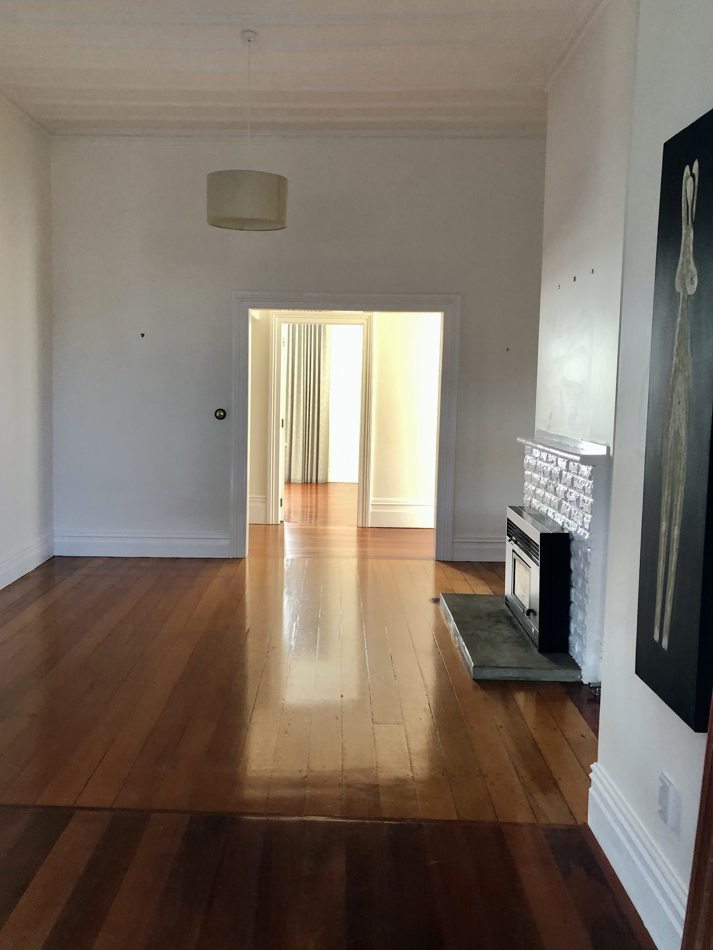
Above: In this renovated bungalow living room the space feels so much lighter and more inviting with new engineered timber flooring and beautiful furniture that fits the space.
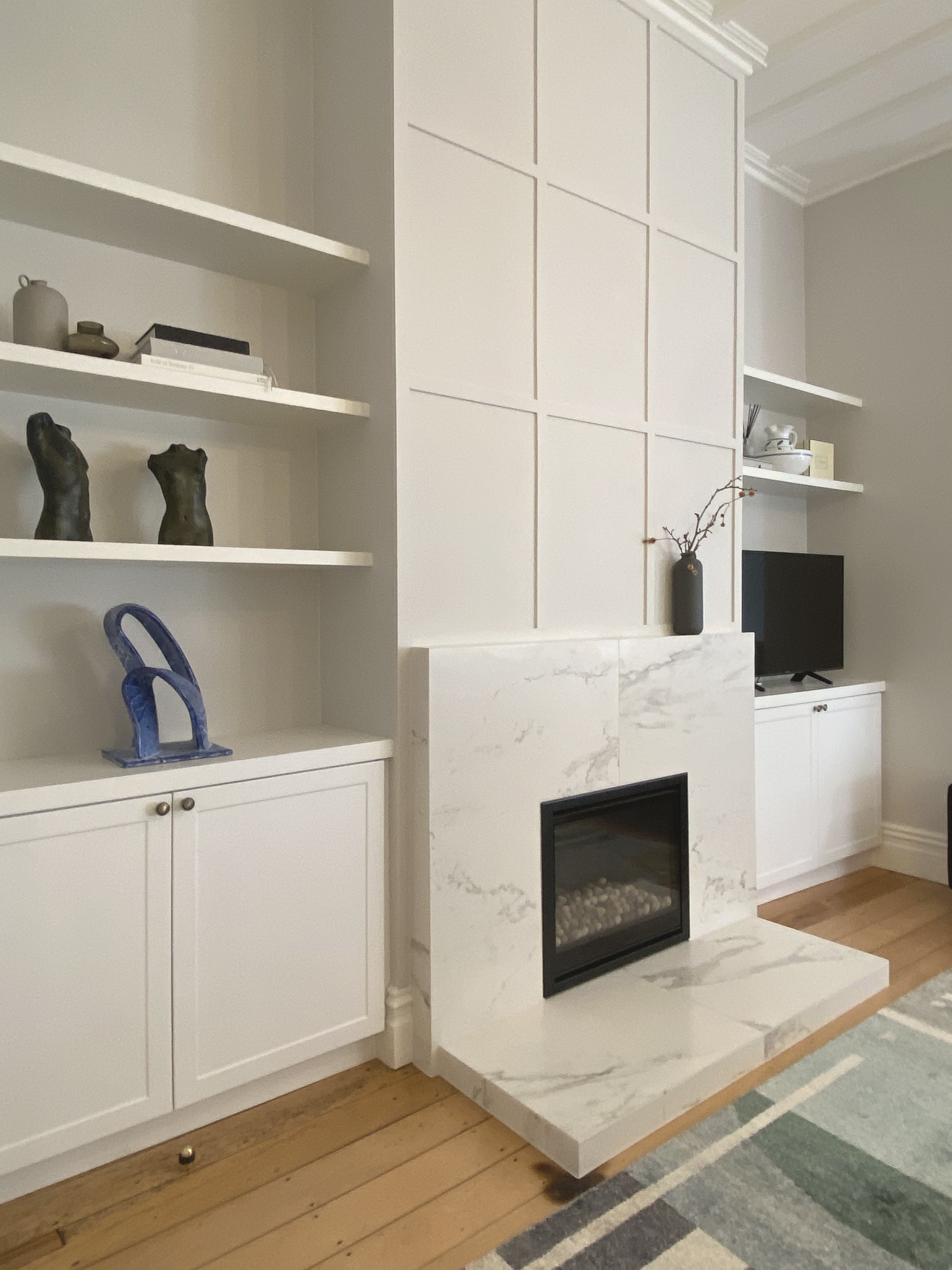
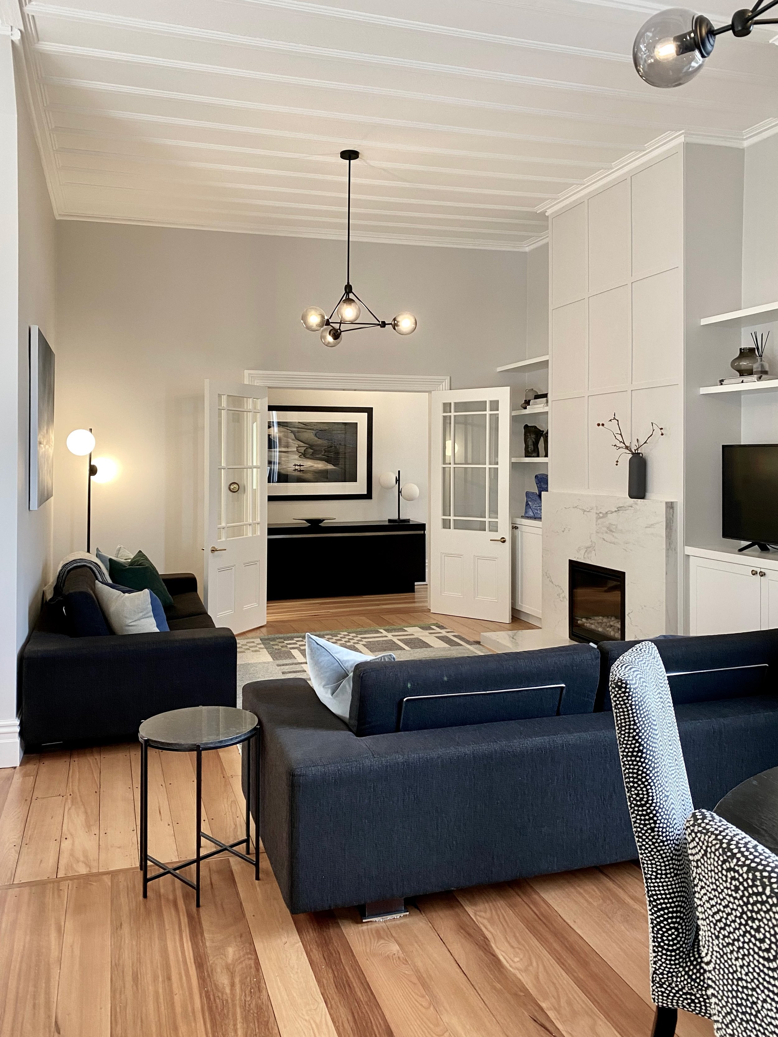
Above: This living room felt a bit cold and unwelcoming so we turned it into a cohesive space with some built in custom cabinetry, along with new furniture and artwork, which completely changed the way it looked and felt. Now it’s a cosy space for entertaining or just for family nights in front of the fire.
Above: To turn this TV room into a cosy snug we used a textured linen wallpaper, navy wool carpet and comfortable new furniture. The existing shelving was painted a deep blue with brass pulls replacing the old handles. The drapes were relatively new so we kept them and they look amazing against the linen wallpaper.
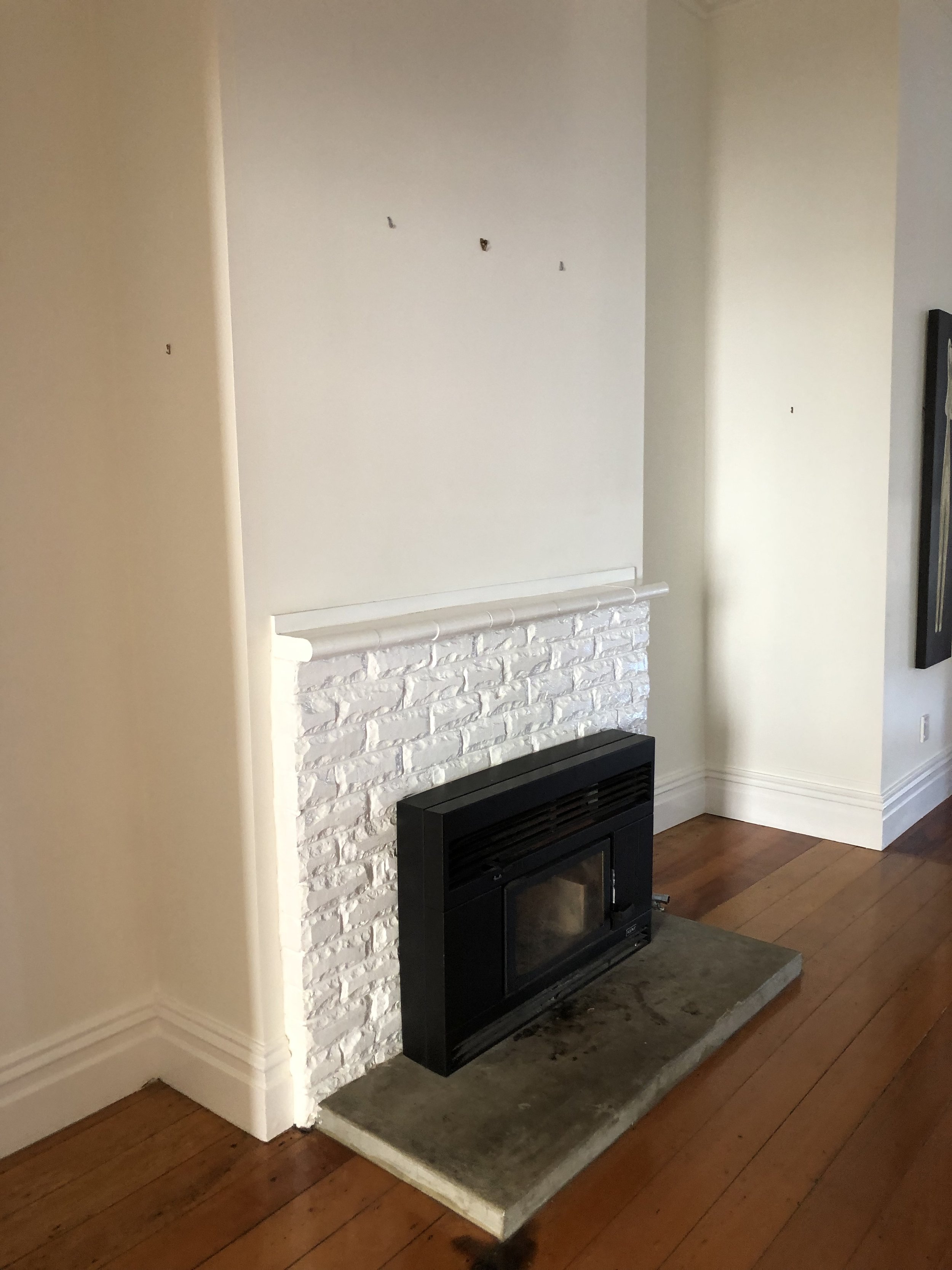
Above: This fireplace was a bit of an ugly duckling to say the least. We were not able to completely remove it nor interfere with the brick facade as it would have made it unstable. We replaced the gas fireplace insert then tiled over the old brick surround. We then had the builder add some simple panelling on the wall to add a bit of character. Finally we had custom cabinetry fitted either side with shelving for display and a space to sit the TV on the right hand side so that it would be visible from the kitchen island.
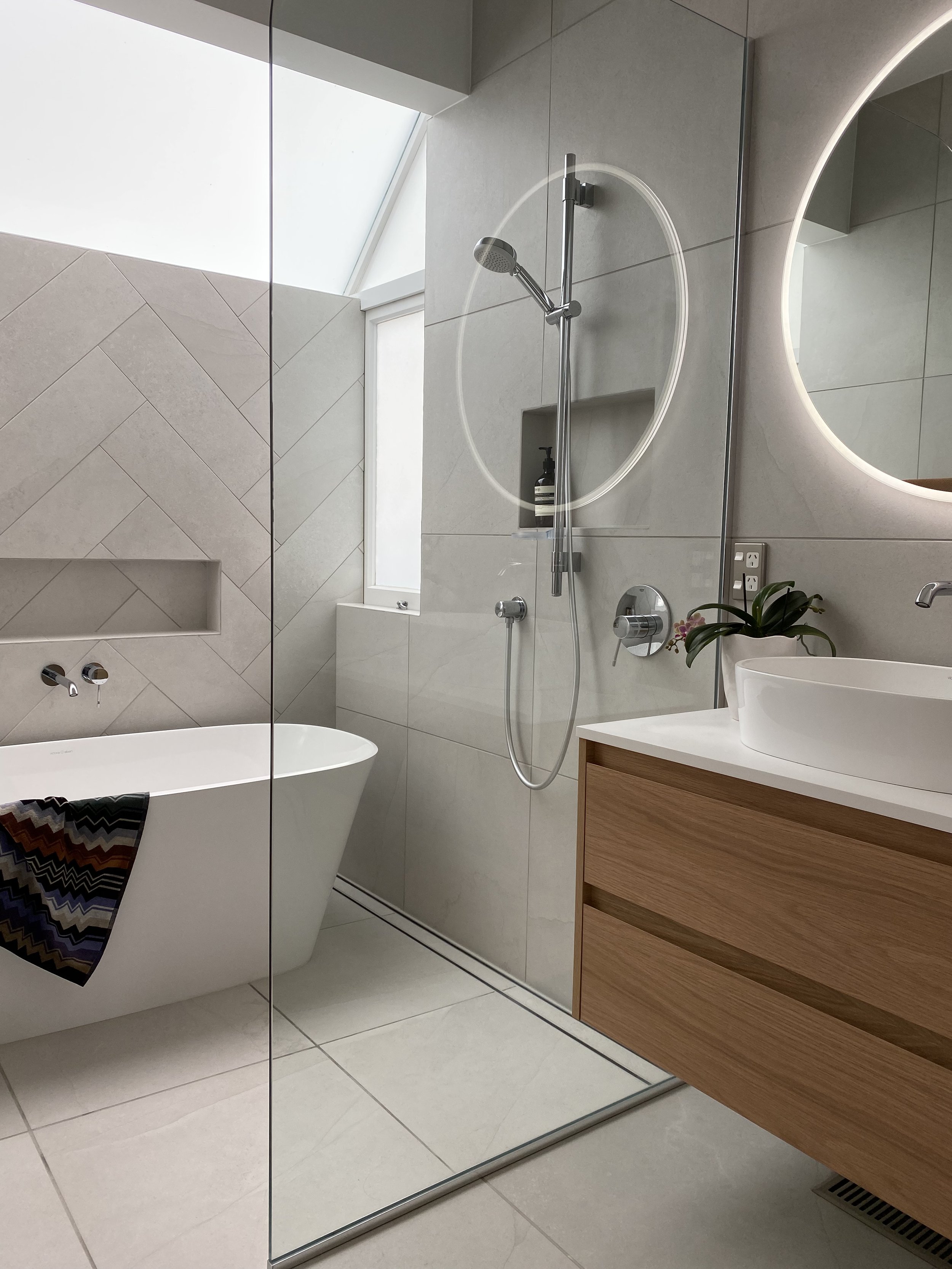
Above: These two bathrooms were renovated within the existing spaces, so no major layout changes. We selected new tiles that were used in both bathrooms and were cut down and laid in a herringbone pattern on the back wall of the main bathroom behind the bath. With all new fittings and improved storage both bathrooms were completely transformed.
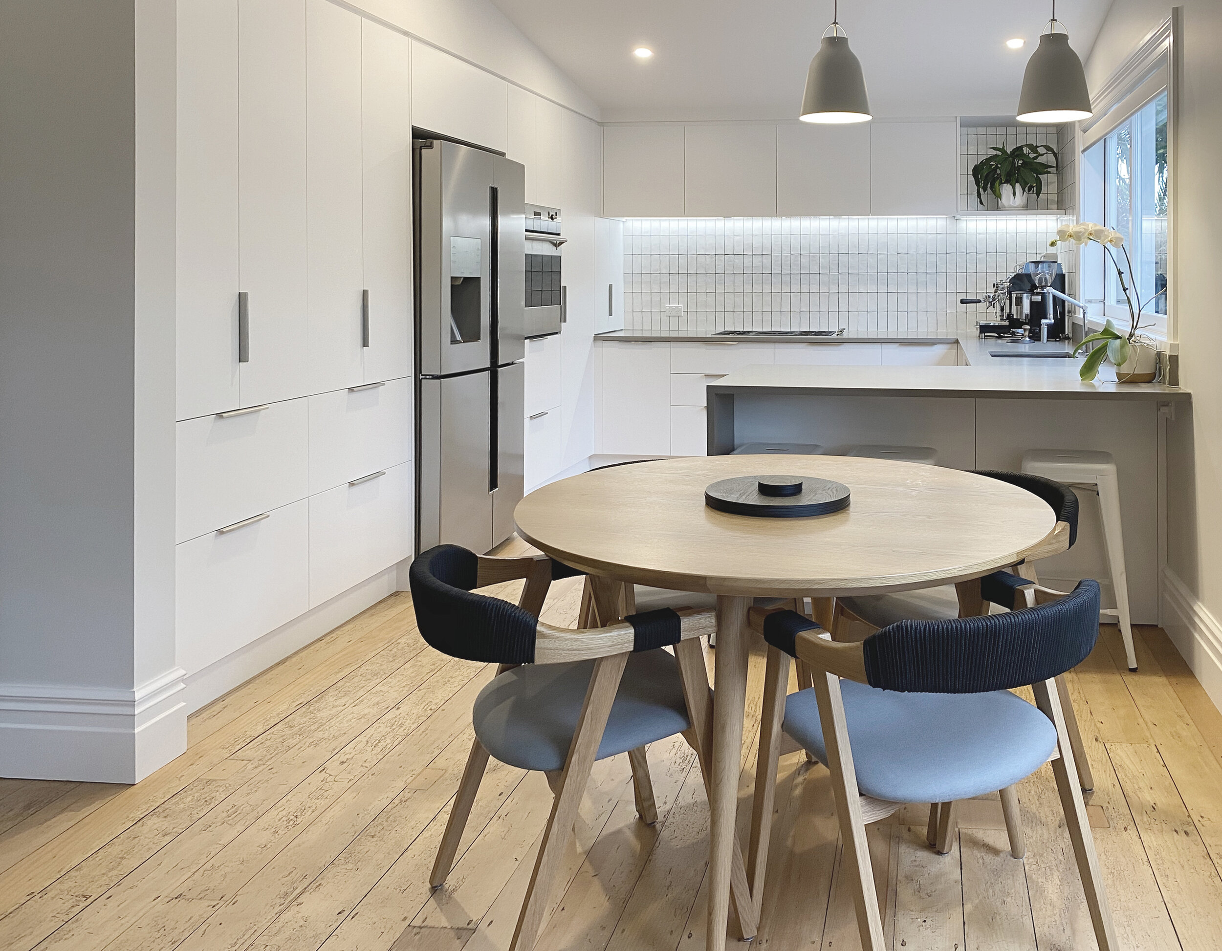
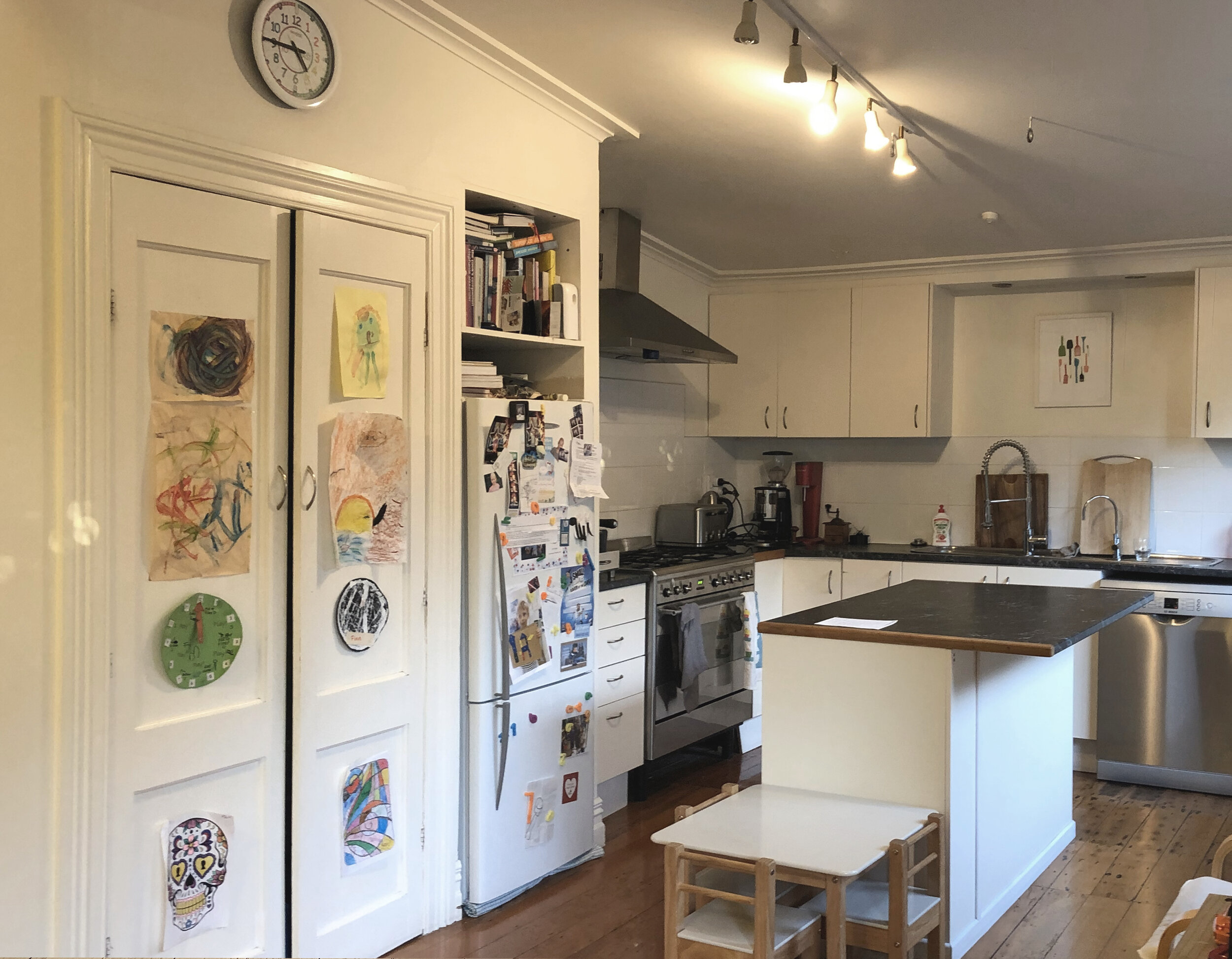
Above: In this kitchen and dining room we changed the layout and removed the central island creating a more open kitchen with space for the family. A small breakfast bar was added on one side and a crisp white palette lightened up the whole space.
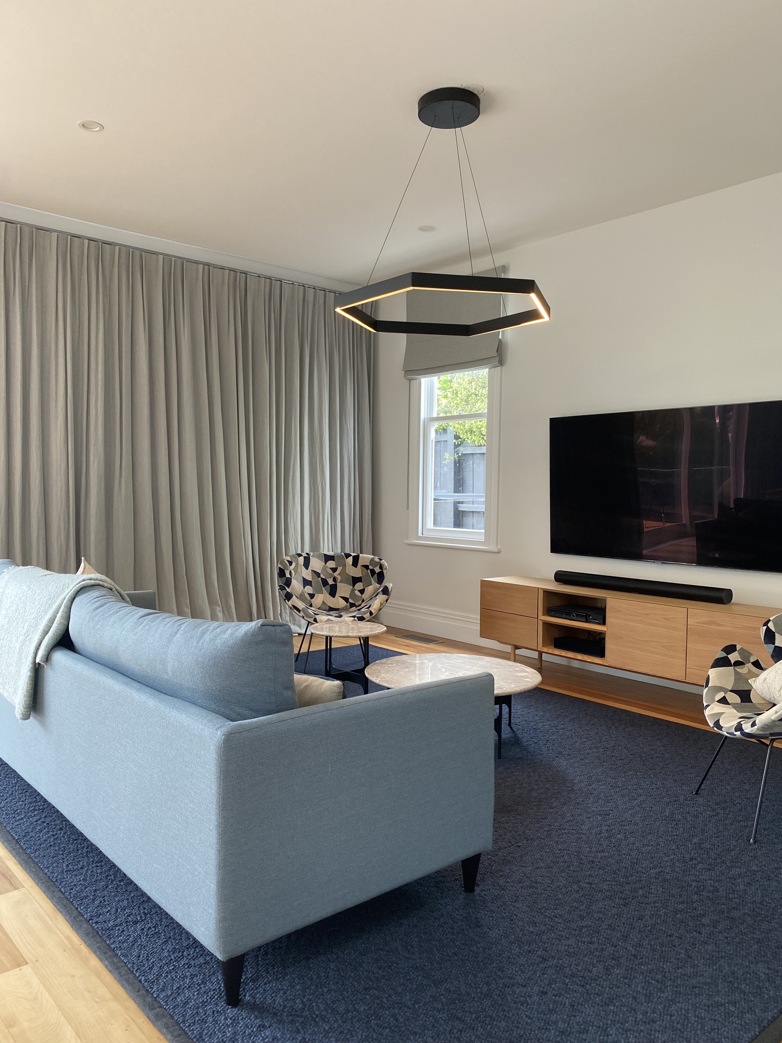
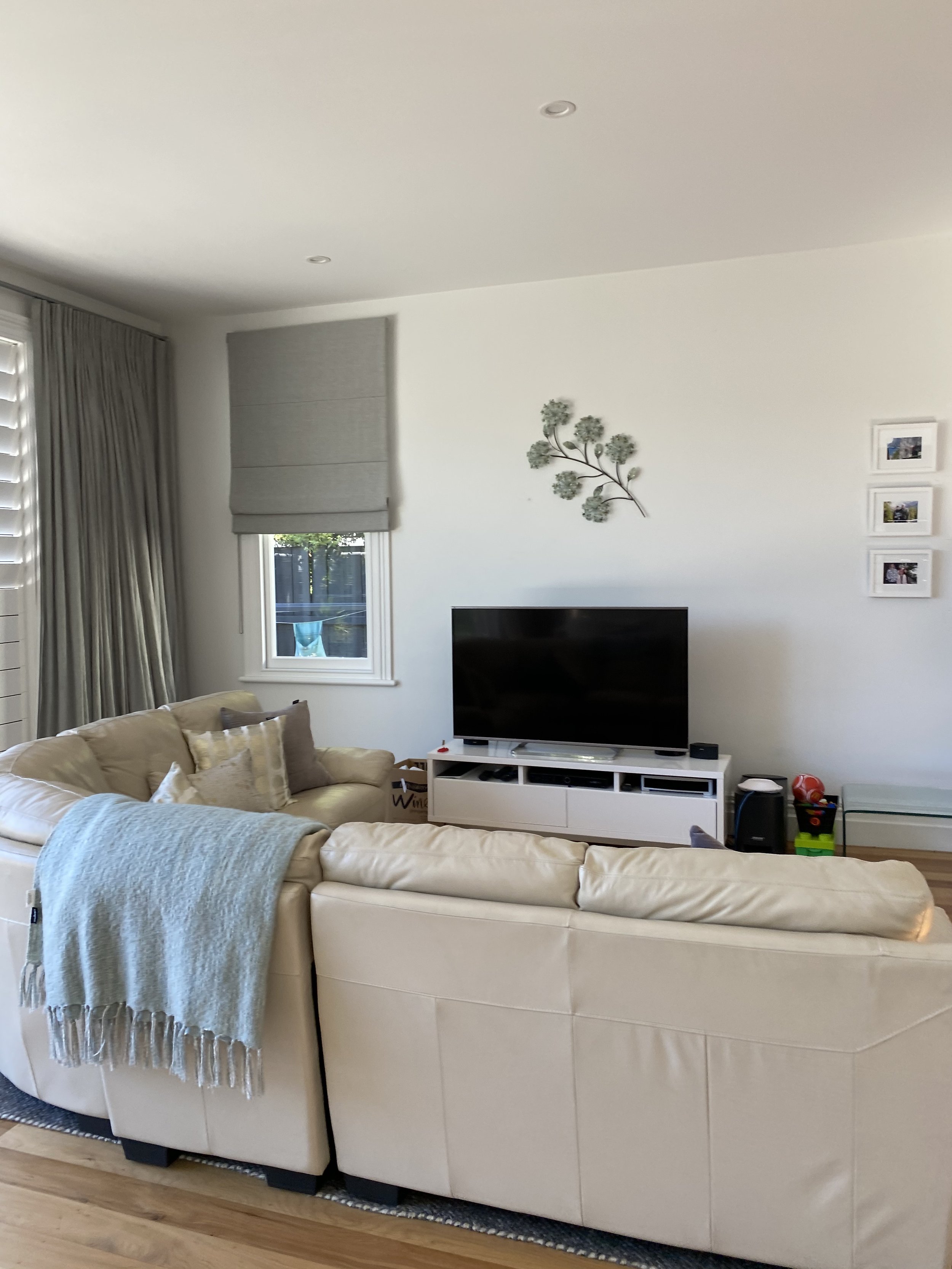
Above: Our client wanted a new look for her living room. We sourced new furniture, having the sofa and area rug custom made for the space. We added a beautiful feature pendant which really helped define the space. The end result is an inviting and comfortable room that our clients love.
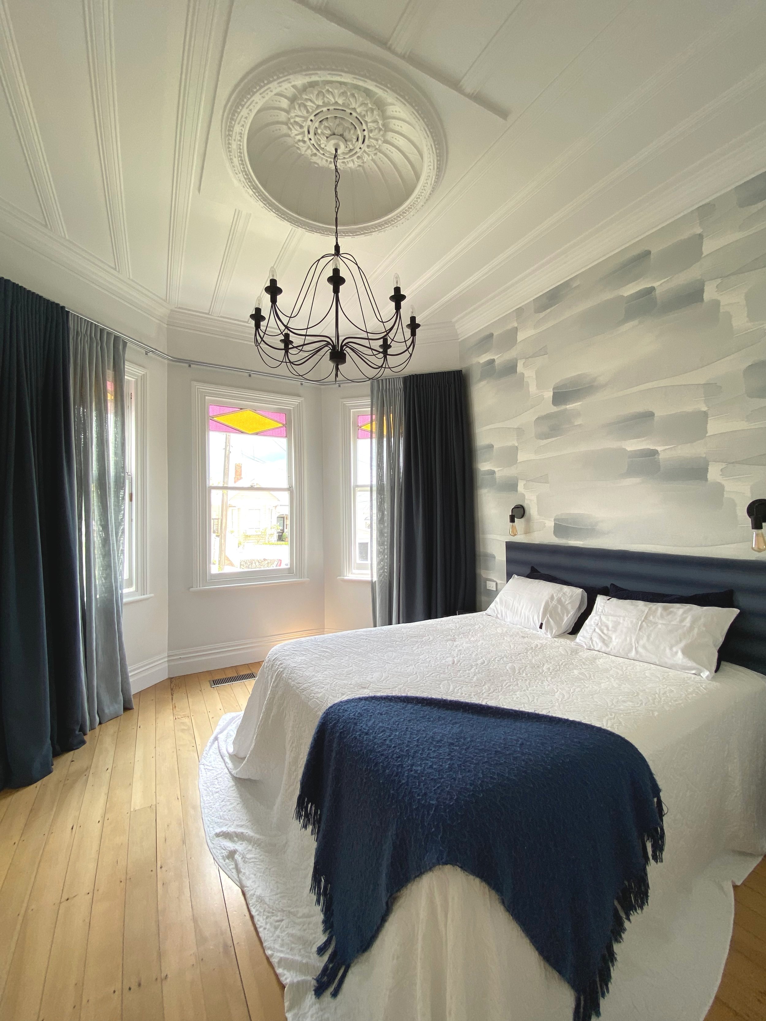
Above: In the same house, our client wanted to update the master bedroom without completely changing everything. We added a beautiful Emma Hayes feature wallpaper behind the bed and new custom drapery with both a sheer for privacy and a heavier drape to pull across at night.
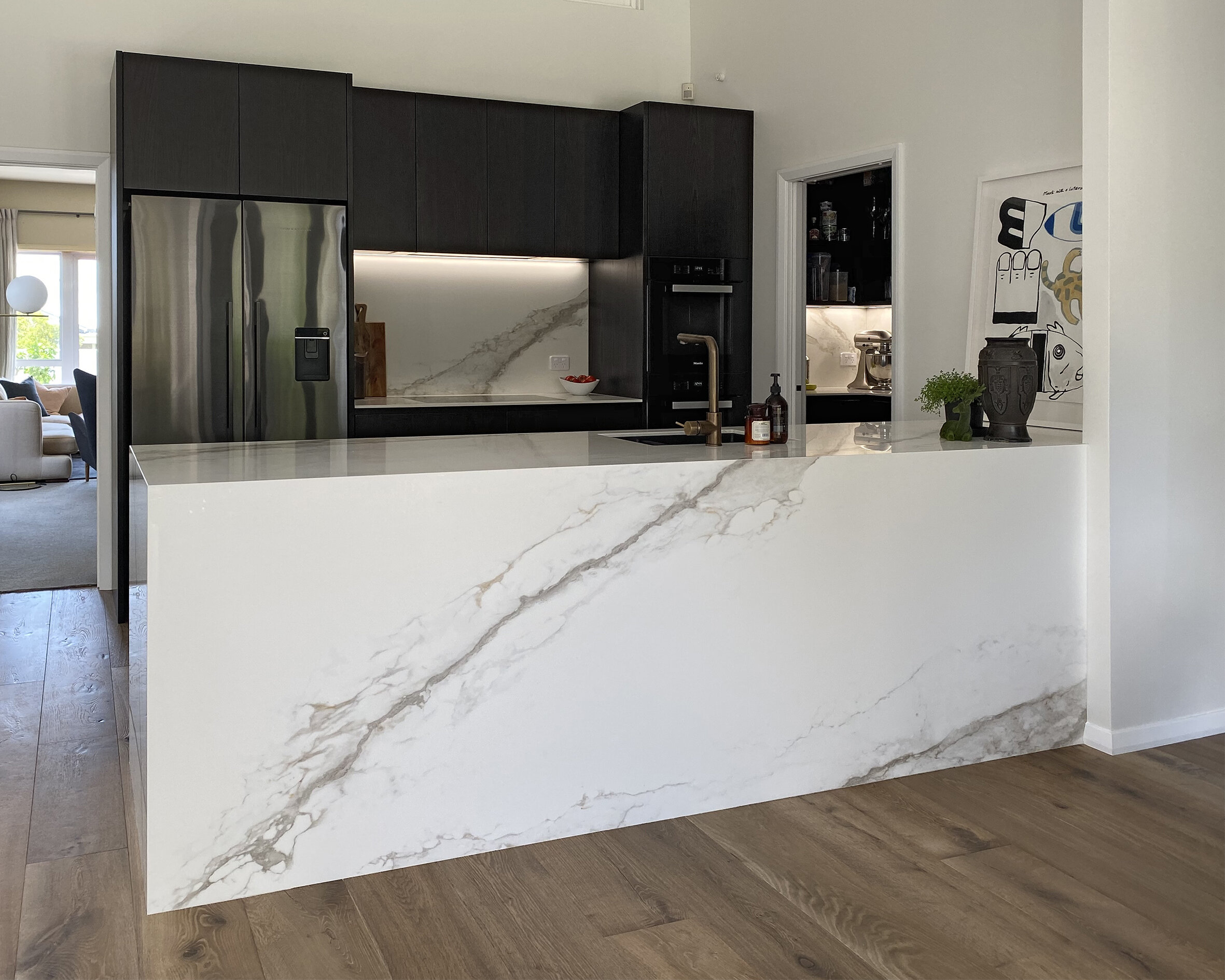
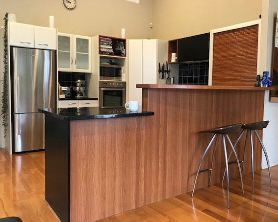
Above: This kitchen was falling apart and the dated layout wasn’t working for the family. As part of a bigger renovation we added in a small scullery and changed the layout from a U shaped kitchen to a practical galley layout. We used beautiful, high quality materials including stained American oak veneer for the cabinetry and iStone for the benches and splashbacks. Our clients are now loving their new kitchen.
