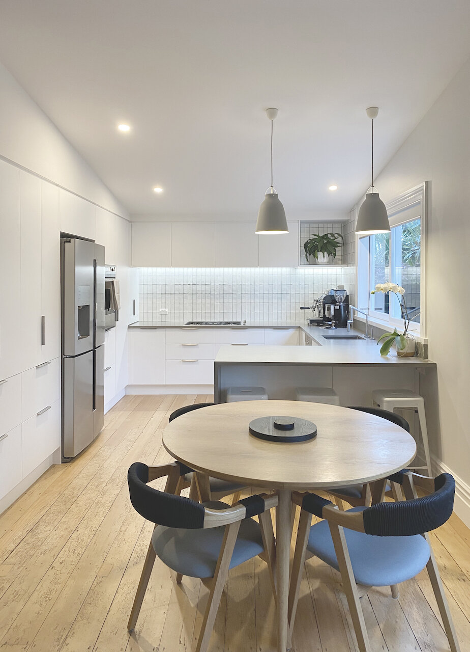
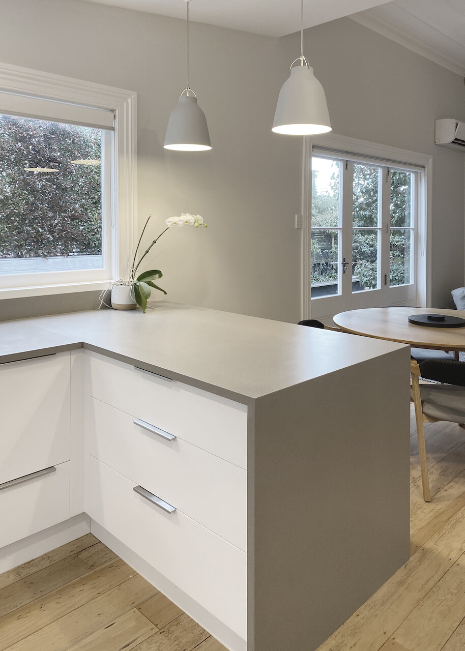
Kitchen renovation - before and after
Villa Kitchen Renovation
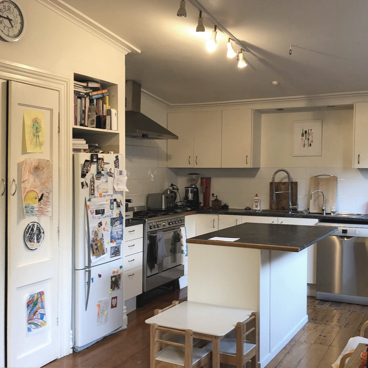
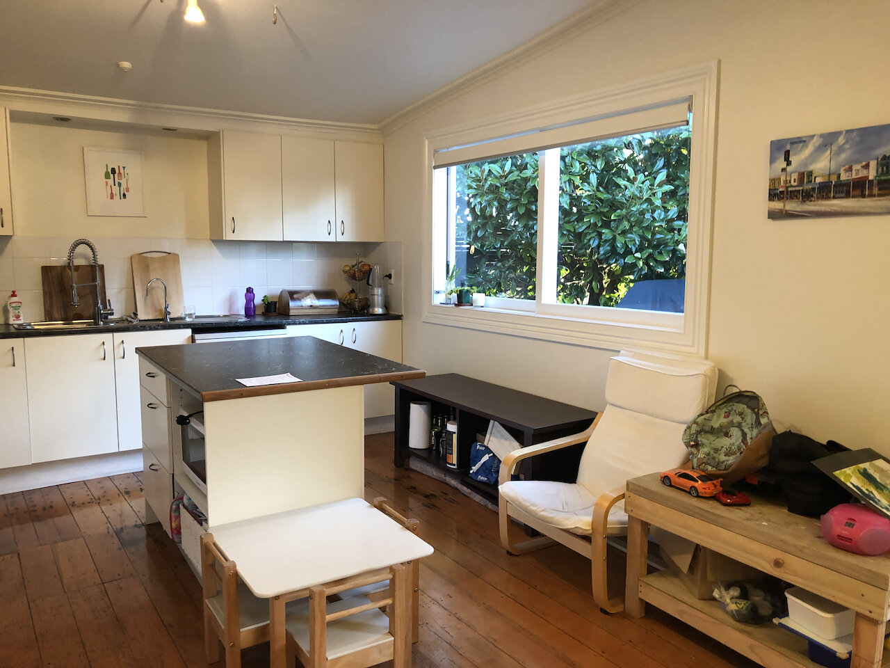
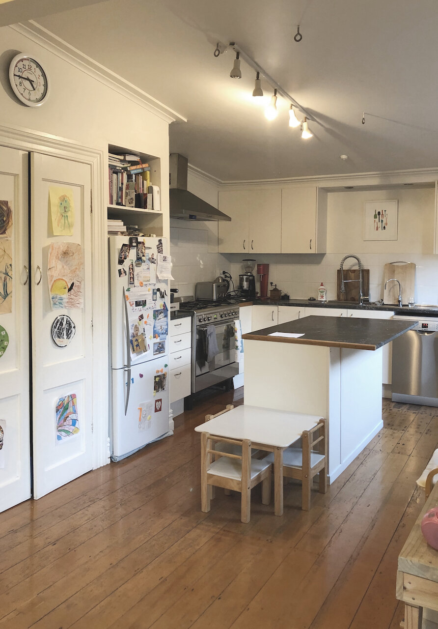
The owners of a pretty bay villa in central Auckland contacted us to help with their kitchen and dining space which was the last part of their house to be renovated. The existing kitchen was on its last legs and the layout didn’t work for this growing family. With the husband a professional chef, they wanted something very practical where it was possible to cook for a crowd but also somewhere that the family could gather everyday for casual meals.
The old kitchen was small, a bit dark and with a layout that just didn’t work. There was already a great window on the right hand side - see below left.
the layout
We came up with an initial plan which used the large window already in place on the right hand side, as a servery to the deck outside, and a small return to create a breakfast bar that the kids could sit at. We demolished the built in cupboard beside the fridge and had the builder build in a bulkhead above, all the way along that side and the back wall, which tidied up the detail between cabinetry and ceiling.
An initial sketch showing the proposed new layout.
The existing small central island was removed to open up the space and the cooking hob moved to the back wall so that the cupboards to the left could cover the entire wall without interruption.
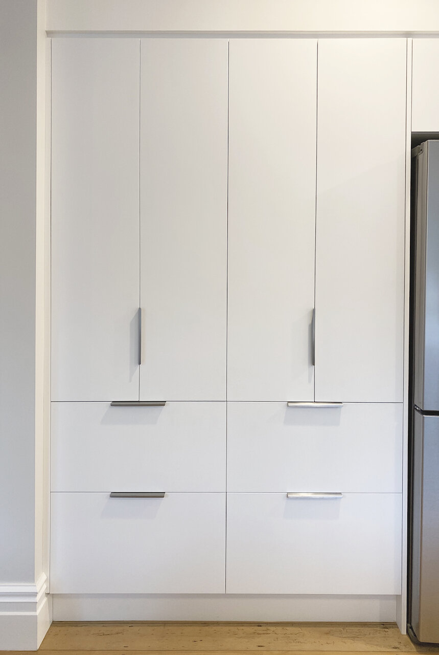
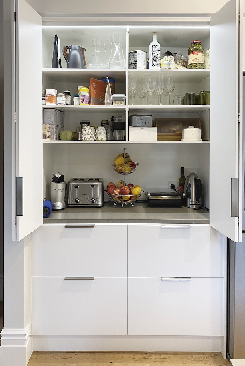
The key feature we added on the left hand wall was a breakfast pantry. This is a place where small appliances can be concealed behind bifolding doors and breakfast food kept for easy access. The deep drawers below the bifold doors hold all the food items.
space planning
Layout and furniture options presented to the owner.
We worked with the owners to figure out the whole room layout - not just the kitchen cabinets. This is a multi purpose space with a small seating area at one end and a dining table big enough to fit the whole family. We needed to ensure that all the zones were clear and that there was enough space to comfortably move around without bumping into furniture or each other!
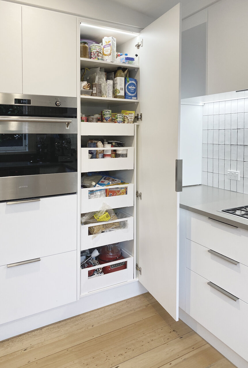
The main food storage area is this tall pantry in the corner with easy access drawers that fully extend. The clients selected a large 90cm wide oven so we positioned it at bench height so that no bending down is required when opening it.
The sliding window above the sink acts as a servery to the outside deck area - perfect for BBQs.
Sneaky wine storage area behind a door.
Breakfast bar
The breakfast bar area really improved the function of the space. It’s not so big that it impedes the opening to the kitchen, but it makes the space much more social and the kids can sit at the bar while mum and dad are busy in the kitchen. And as an added bonus, we were able to create an area for wine storage beneath the bar area in a concealed cupboard. This eliminated an awkward corner on the kitchen side and meant we could add in a set of drawers for the cutlery etc on the kitchen side and have it nice and close to the dining area.
storage
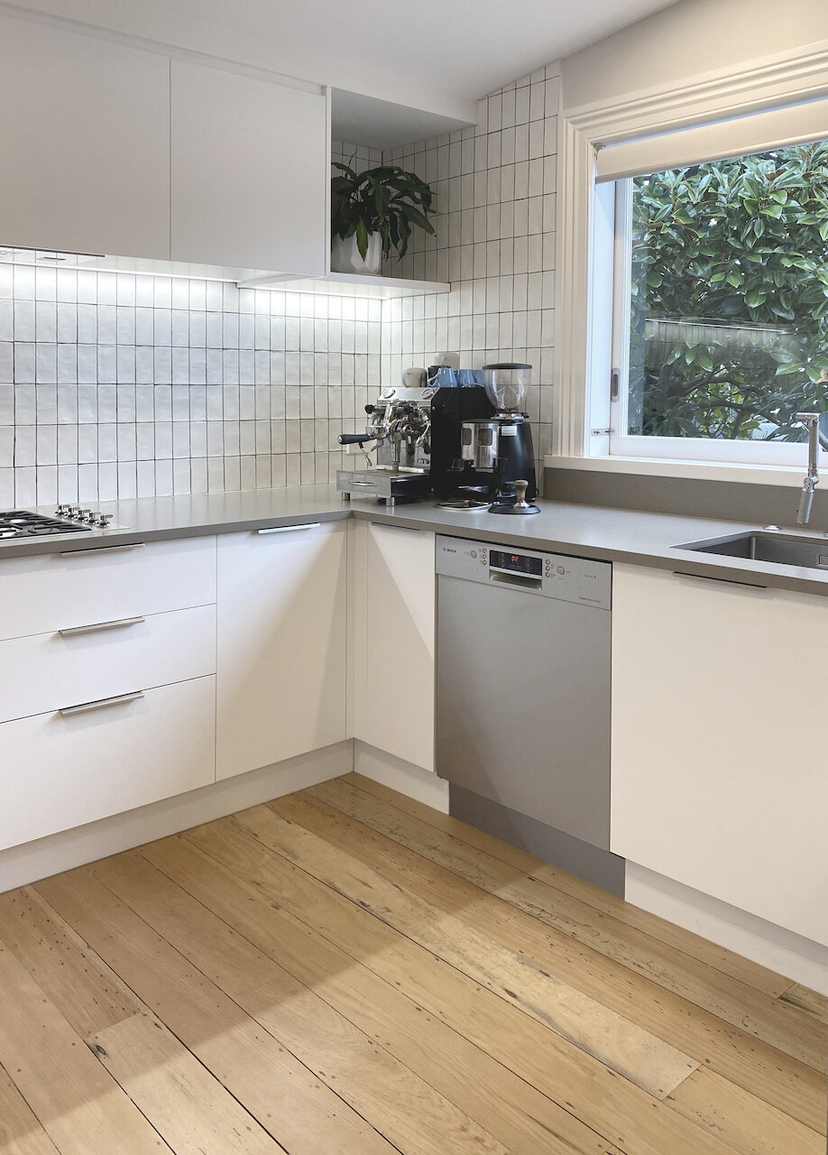
Although not a large kitchen, it’s amazing what we managed to fit in with some careful planning. The corner spaces were put to good use with my favourite corner pull out - the Hafele Le Mans. It glides out really easily and fits a surprising amount, including heavy and large items like pots and casserole dishes.
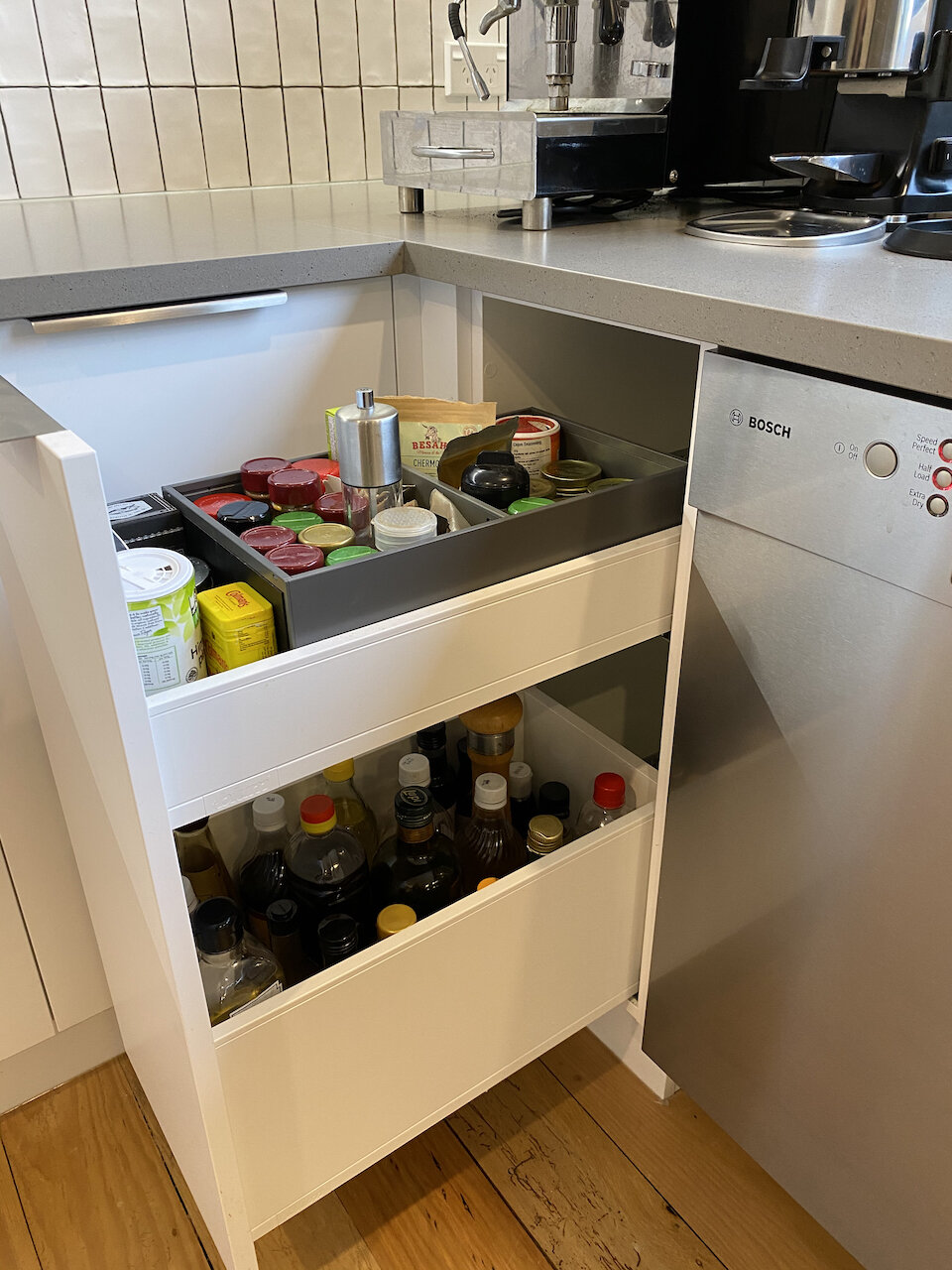
The narrow pull out beside the dishwasher, and within easy reach of the cook top, was used to hold cooking oils, herbs and spices.
Lighting
Lighting was another important consideration. The space was quite dark with the old kitchen so better lighting was needed. Having a crisp white palette really helped brighten the space as well. We selected the beautiful Caravaggio feature pendants above the breakfast bar from Cult Design. Additional LED lighting was built into the cabinetry and some recessed ceiling lights were also added.
The project was completed just in time for summer and the owners have been enjoying being able to make much better use of the whole space. It’s now become the real hub of their home.
If you are interested in talking to us about your kitchen and what we can do with your space, give us a call on 021 504-145 or send us an email with some more details about your project.
